
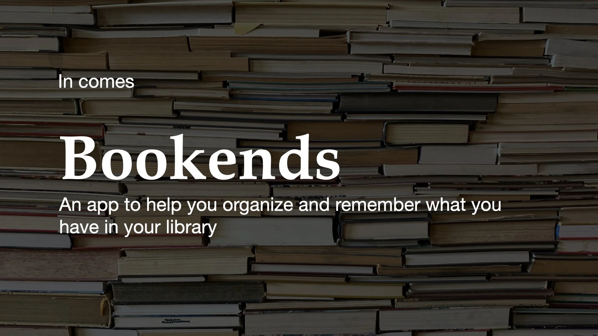
Bookends
A library management app

Project Overview
Bookends is an app that I designed to help people with large libraries manage their books. The app provides a place for people to enter their books, enter notes, quotes, ratings, and tags.
Objective
Iterate through design workflow starting with discovering problem area, creating a pitch deck, wireframing, and a clickable prototype.
Exposure to wireframing, designing and prototyping in Figma

Problem Area & Pitch

Wireframes & Annotations

40% & Clickable Prototypes
Problem Statement
How can we create an app that not only helps individuals organize their personal libraries, but also search, rate, and organize the information?
The goal of this project was to create an app that helped individuals with large libraries. The app would help users import their book information by either using the camera to take a photo of the barcode or allow for manual input of their books. From there users could take notes, rate, and tag their books. With the information gathered from users, we could then give them books that were similar to the books they enjoyed.
Pitch Deck
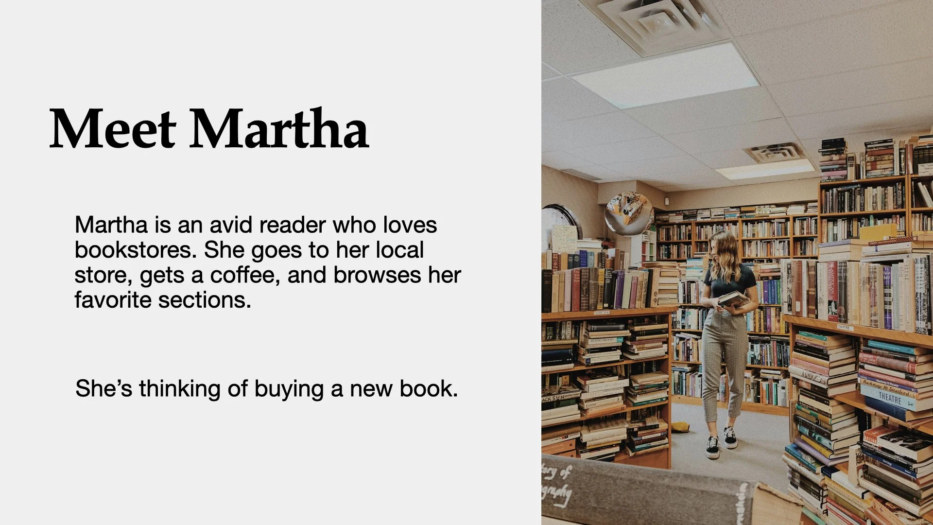
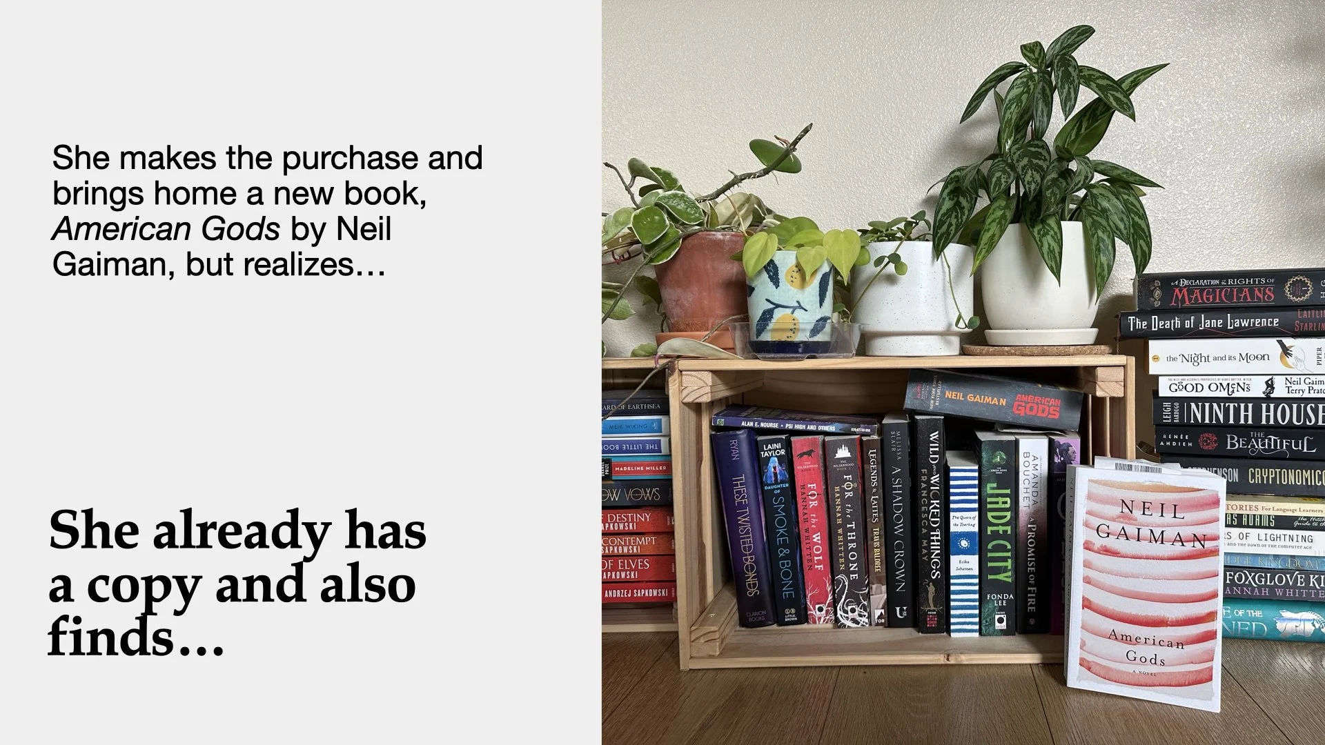
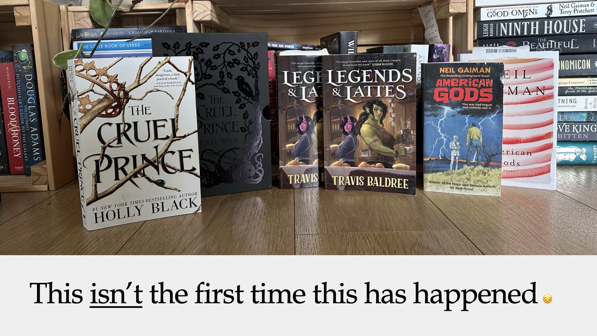
The first step to this project was to create a pitch deck that would be seen by someone outside of the realm of design. I created a compelling story about a girl who loves book stores and buys books to go home and she realizes that she already owns a copy of the book she just purchased. She then reviews her library and sees that she has done this multiple times.
I also found some statistics about books and found the following
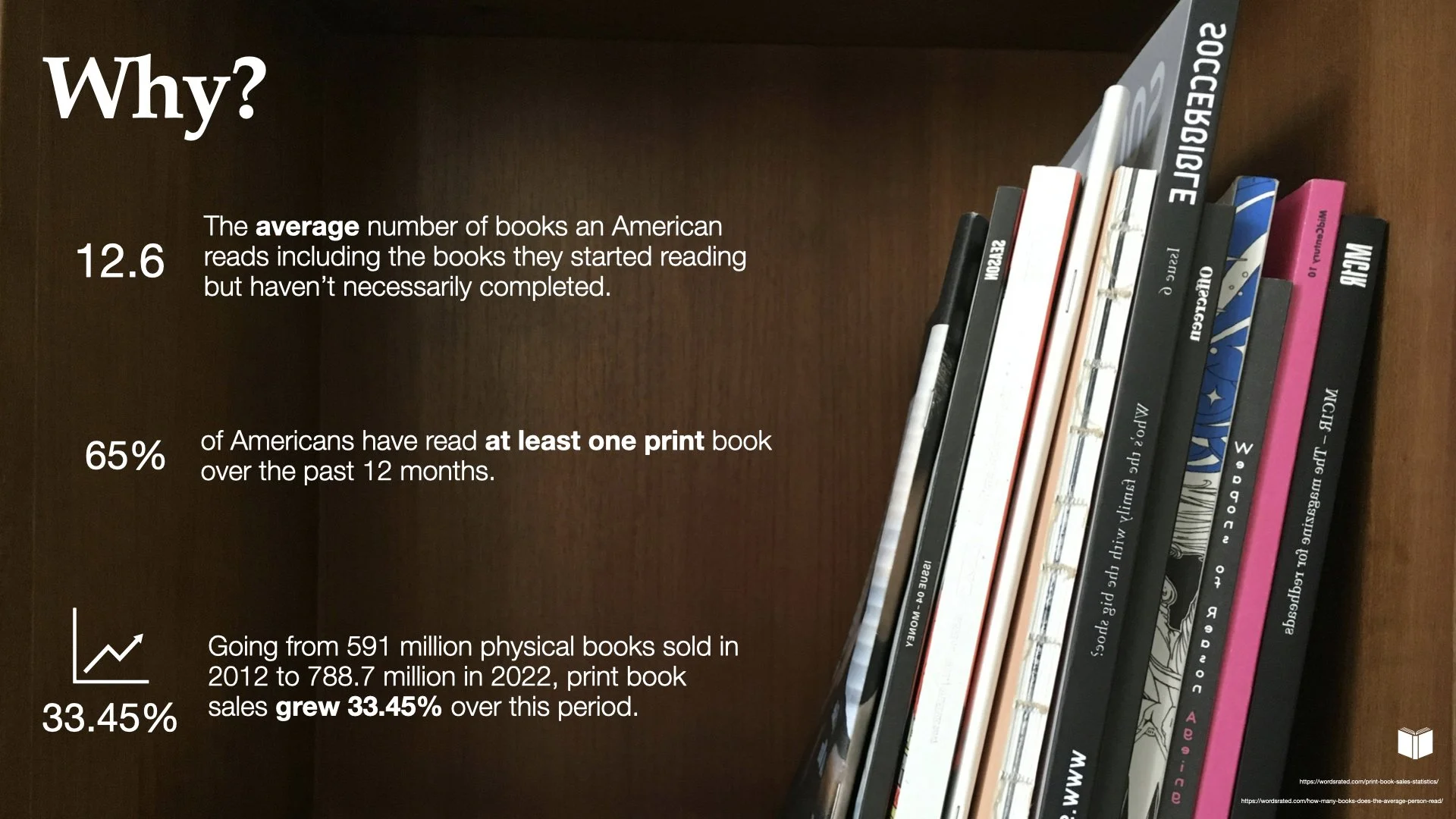
12.6 is the average number of books an American reads including the books they haven’t completed
65% of Americans have read at least one print book over the past 12 months
33.45% growth in book sales over the past 10 years
Mood Boards
I wanted the app to feel very light and airy. I knew that there would be multiple book covers that were not cohesive, so I tried to develop a neutral color scheme to back it. Mid-century colors seemed like they were a good starting point for the color choices.

User Flows
In order to make sure the app delivered a great library experience, I dialed in on the user flow to ensure that all tasks were being met. This user flow has the four main functions of the app: adding a book, viewing the library, searching, and recommendations.

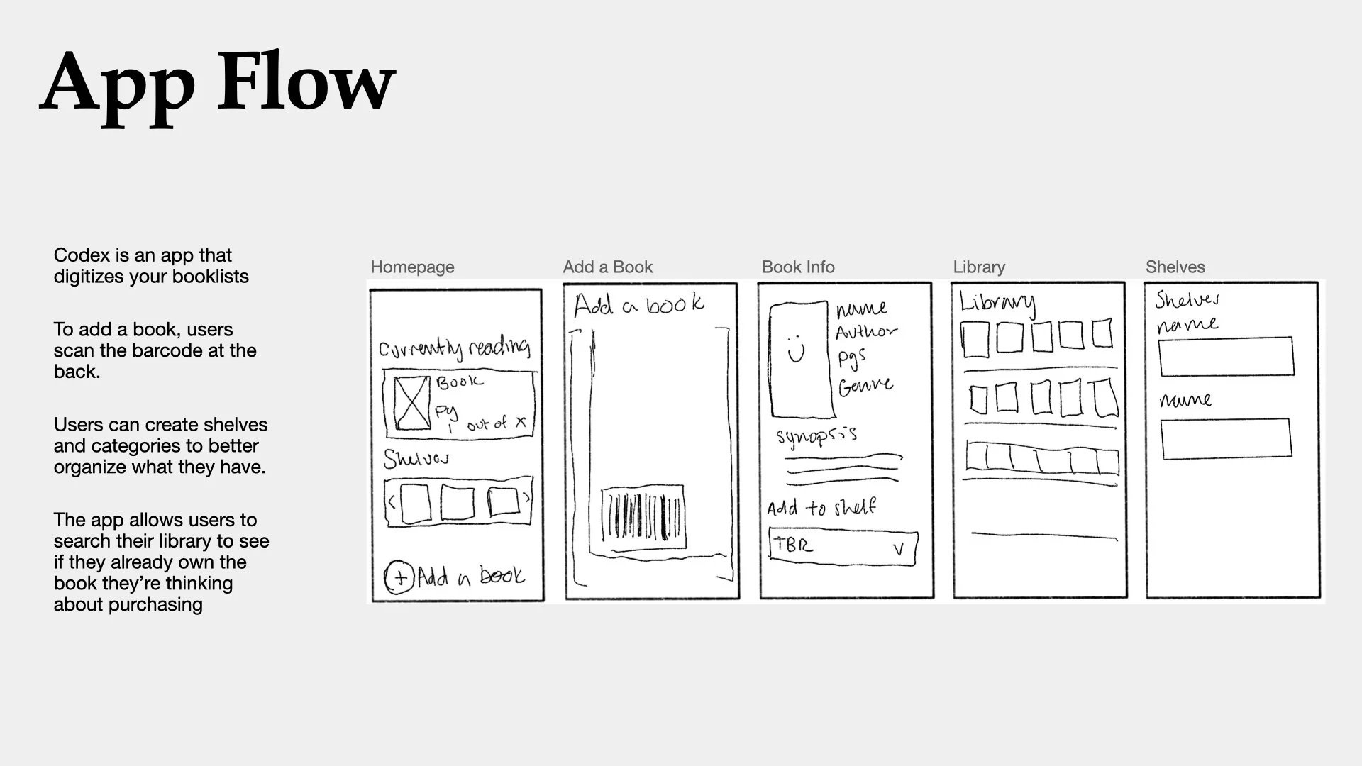
Wireframing
Once I had the user flows mapped out for some key areas of the experience, I dove into wireframing. As a first exploration into this process, I found that it made making decisions a lot easier and allowed for quicker iteration. Later in the process, it made moving into a higher fidelity prototype much easier.
The color sketches below were what was happening before figuring out the overall flow of the app. I had tried jumping straight into high fidelity prototypes without figuring out the bones of the experience. Taking a step back and diving into wireframing allowed for me to create a stronger and more cohesive final product.

Annotated Wireframes
Components
This project also allowed me to dive into the world of Figma and components that used variables. I worked through making sure that each of my fields had a initial, active, filled, no cursor, and error state. These components and their creation allowed for me to have more in-depth, clickable prototype.

40% Mocks
The 40% mocks were where I could explore color and typeface. This process, in the past, had taken me so much more time because I would iterate without doing the wireframes and ensuring that the experience flowed from one screen to the next. I was able to look at the mood boards I had created while concepting the project and pull my colors and inspiration into the final product.
Clickable Prototype
I ended up really focusing in on the “Add a Book” user experience for my clickable prototype. This was my first experience in utilizing Figma’s prototyping feature. While simple, I think it gets the general idea across of what I wanted the experience to feel like.
To view prototype click here or the image.

Bookends Visuals


