Copa
An AI-enabled app for managing anxiety

Project Overview
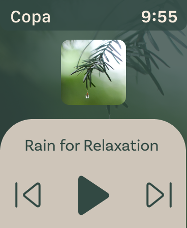
Copa is an app that is designed for someone who suffers from anxiety or stress. It takes biometric data from a wearable ring and prompts the user with different mindfulness techniques depending on the environment and previous successes.
This project was an exploration into the world of UI/UX design. The goal of the project was to try and apply the design process I have been honing into a new medium.
Discovery & Analysis

Sketches & Mock-Ups

Text, Color & Accessibility
Problem Statement and Research
How do we help people with anxiety ground themselves by detecting physiological responses and use AI to prompt meditation or other calming activities?

Anxiety
Anxiety, a prevalent mental disorder that affects nearly one-third of the population, is a condition that varies in intensity, ranging from mild discomfort to debilitating impairment in daily life. Anxiety is particularly impactful for women in their midlife, with its effects extending beyond mere unease to negatively impact their overall well-being. Understanding the diverse manifestations and severity of anxiety is crucial in order to provide appropriate support.

Mindfulness
Several studies conducted over the past decade have consistently demonstrated a strong correlation between engaging in mindful practices and a significant reduction in both anxiety and stress symptoms among individuals. Mindfulness techniques encompass a range of activities such as practicing yoga, engaging in regular exercise routines, journaling, and controlled breathing exercises. The growing body of evidence supporting the positive impact of mindfulness on mental well-being highlights the importance of incorporating these practices.

Artificial Intelligence & Wearables
No two people have the same anxiety response so artificial intelligence could build a profile for each user. Not everyone has as much response or severity when having a panic attack. By learning behaviors, geo data, voice patterns, phone usage, and questionnaires, the wearable could help predict and assist users in time of need.
By utilizing a smart ring, we can gather metrics like heart rate, skin response and temperature, to respond in real time with helpful feedback.
Empathy Mapping
Empathy mapping helped me discover what truly matters to the end user. By developing both a persona and situation that might affect them, I was able to better empathize and understand what would help in that situation.
The persona I used for my empathy map was a young woman in college. She is someone who gets very overwhelmed with the list of tasks she has for both school and work and the pressure from her parents.
Gains:
Something always in their corner
Greater emotional well-being
Lessen Anxiety and stress
Gain coping mechanisms
Better self assessment of anxiety and stress levels
Pains:
Crippling stress and anxiety
Personal relationships suffer
Places stress on loved ones
Constant stress/worry
Sketches and Ideation
Utilizing the previous research, I started sketching. I was thinking about items that could be close enough to the body to get biometric data. I considered something like a necklace or a band around the foot as a way for someone with anxiety or stress to hide the fact that they have it. Ultimately, I settled with rings to ideate on for it’s close contact with skin and ease of use.


Rough Prototypes
The wearable of this project was a ring. The ring would contain sensors that would monitor both heart rate and skin variability. This prototype was made of polymer clay and painted to mimic rose gold.
The papers allowed me to test out certain compositions of my screens. Through these, I was able to paper test what the user flow through the final app would be.

Type and Color
The typeface I used for headers and other catching type was Roca. Roca features a somewhat playful, almost retro feel. For the body, I used Basic Sans for legibility and for its wide range of weights and styles.
The colors I wanted to keep very neutral and grounded. For the tertiary, I looked at both tree bark and sienna clay for the contrast needed for actions within the interfaces. The overall feeling I was going for was soothing and relaxation.

Buttons and Accessibility
In adherence to WCAG guidelines, I've ensured that not only are all my buttons large enough for legibility, but they also function as accessible touch areas. I wanted to ensure that anyone could benefit from my app regardless of their ability.
The diagrams to the right are there just as a way of displaying the sizes and touch areas. The spacing is not up to WCAG guidelines for tap.

Watch Screens
The watch screens were developed to test if the app could be responsive and usable within a smaller form factor. I utilized brand colors and common forms to unite the two experiences.
The watch functioned as an extension of the phone app, allowing users to interact with content without having to take out their phone. This function also allows for more discreet meditation and app assistance.